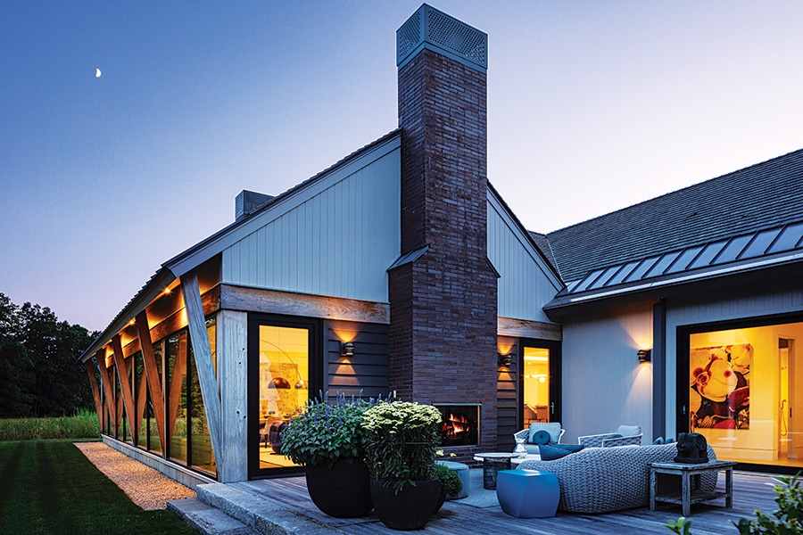
The home’s exterior materials were selected for their ability to mellow from the elements in a way that would help it recede with the colors of the landscape. / Photo by Greg Premru
Obscured from the busy road, abutting the Charles River, amid a vast field in Wellesley bordered by 7 acres of conservation land, no one could tell what type of structure was being built on this site during construction. “People in town weren’t sure if it was a residence or something else,” recalls John Day, principal of Blue Hour Design.
The lucky ones who’ve been able to travel down the home’s long drive discover a distinctly singular domain: A home comprised of a series of low-slung, agrarian-inspired buildings joined by glass connectors. “The scale of the design was intended to echo the farm vernacular of the homes in the surrounding area,” says Day, who set the interior architecture and design when he was a principal at LDa Architecture & Interiors; Brianna Boidi assisted on the project. In reverence to the setting, Day notes that the homeowners didn’t want the house to look too traditional or pop out of the landscape more than necessary. Mature trees shield a pool and tennis court, while vegetable gardens, a wildflower meadow, stone walls, and large swaths of verdant lawn encompass the landscape of the secluded property.
The couple, who are Dutch, embraced a clean European design sensibility. While the home utilizes common New England gable and barn forms and materials, a modern approach was taken to detailing, finishes, and décor. Functionality was key: “Everything in the home was designed to be used,” Day notes. “They have three kids who are almost grown and many long-term guests. Family life and entertaining are at the core of the design. They cook, they garden, they play tennis and swim daily.” Lifelong vernacular materials—oak flooring, full cypress timbers, zinc-coated copper, bronze, plate steel, and local granite offer texture and living finishes but nod to barn forms, he adds. “Traditional agrarian design that is purpose-built and about function, not ornament.”

Bold pops of color and a swing infuse the kids’ zone with energy. The handpainted mural on the wall is a replica of a piece created by pop artist Roy Lichtenstein. / Photo by Greg Premru
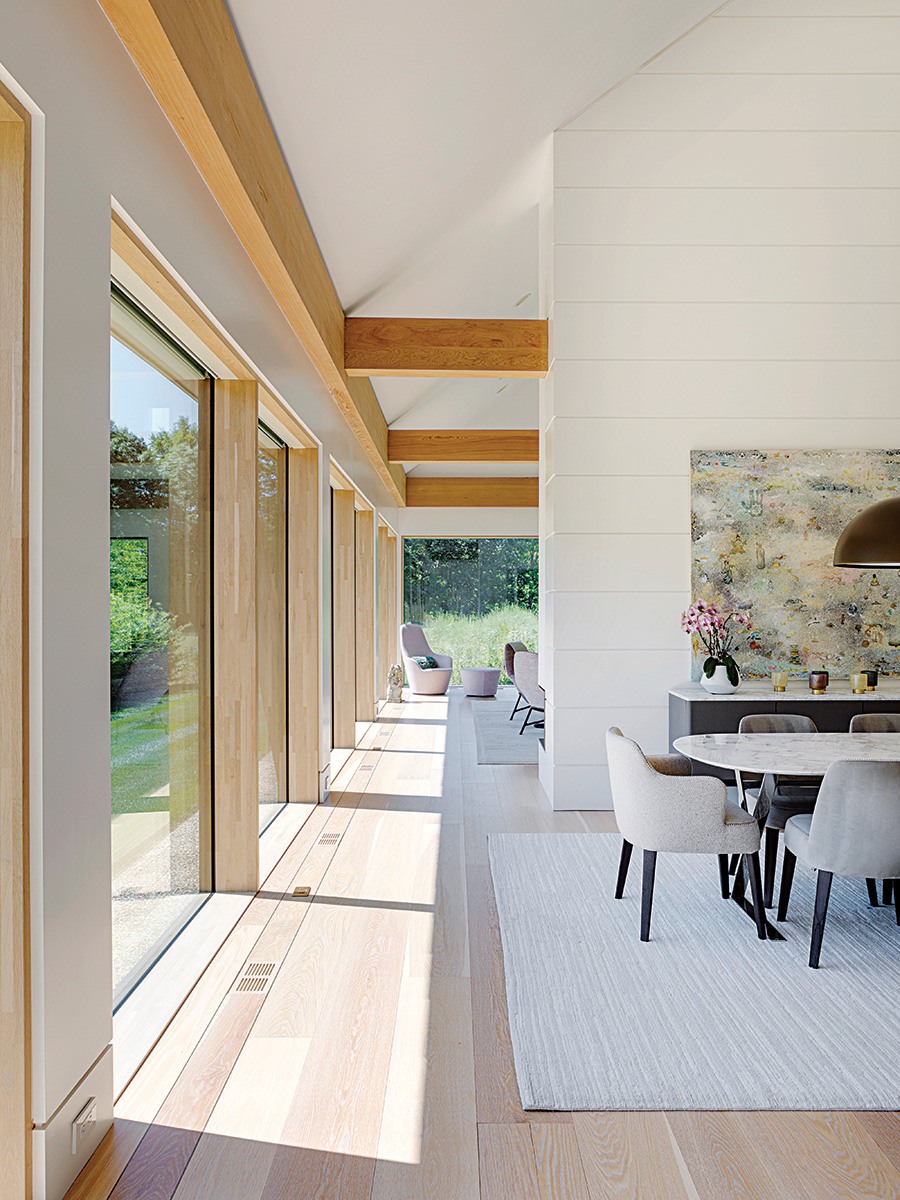
Fumed white-oak floors and white walls allow the views from the expensive windows to take center stage. In the dining area, an interior wall was created to display art and as a place to lean the sideboard up against. / Photo by Greg Premru

The dramatic steel-and-glass cantilevered stairway—fabricated by Make Architectural Metal—is a showpiece that greets visitors through the window as they approach the home. The wall surrounding the front door felt too stark painted white, so a wallcovering festooned with butterflies was selected to add interest that resonates with the landscape. / Photo by Greg Premru
Beyond the front door, an extraordinary floating steel-and-glass stairway beckons one with a sense of mystique. “The homeowners really want the house to feel found when you arrive,” Day says. “It was designed not outwardly, but inwardly.” Sweeping views of the yard are framed by gigantic windows throughout ensuring a constant, unbroken connection with the outdoors. The main living spaces are integrated with an open floor plan, yet each space is distinctly defined. In the family room, a fireplace wall extending up to the ceiling serves to visually separate the space from the dining area without enclosing it while providing a place for a sideboard to slide up against by the dining table.
Seasoned art collectors, showcasing the homeowners’ collection was a primary focus of the interior design. White nickel-gap walls serve as a backdrop for bold paintings that compel one to look deeper. “The homeowners are really chic and cool; they have a phenomenal design sense,” says Day, noting that though they veer toward a cleaner aesthetic, they don’t shy away from incorporating color into their surroundings. “We used color in a controlled way, with rich, deep jewel tones. Examples include the living area’s purple swivel chairs, the saturated blue tiled wall in the mudroom bathroom, and the yellow moon chair in the upper-level hangout space.
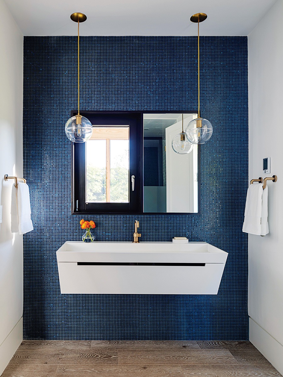
A trough sink in one of the main level bathrooms settles against a wall clad with brilliant blue ceramic tile. / Photo by Greg Premru
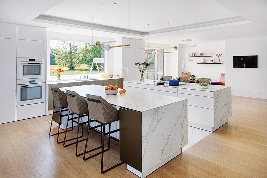
The kitchen, where multiple cooks can work together, is geared for congregating with its two islands. The pendant lights are Lee Broom from Casa Design; the stools are Piet Boon. / Photo by Greg Premru

The integrated dining and living space features an intricate art installation by Teresita Fernández above the fireplace. The Moooi Bart swivel chairs are showstoppers, upholstered in Kriby black-currant tufted velvet and cocoa Piet Boon cotton. / Photo by Greg Premru
With its white lacquer, back-painted glass, and satin-bronze metal cabinetry, the sleek SieMatic kitchen makes a striking form, yet function was paramount. “The homeowners knew the kitchen would get a lot of wear and tear, so they wanted two islands that would accommodate multiple chefs and spaces for eating,” Day says. The islands are topped with Neolith porcelain that extends to the floor between them. “The idea was to create one big block of stone in the center of the room,” he continues.
While the house is spacious, the homeowners were very conscious about the size of each room and its intended purpose. “They didn’t want to just create these cavernous spaces because they could,” says Day, noting that the primary bedroom is not huge. Though it is every bit a sublime space: Herrick & White created a wood surround—an overscale headboard of sorts—for the bed from which tiered cut-glass pendants are hung on both sides. Inset into the wall behind the bed is a large swath of deep-bottle-green suede a few shades darker than the treescape framed by the room’s windows, which in here, as throughout the rest of the house, is always the main focal point.
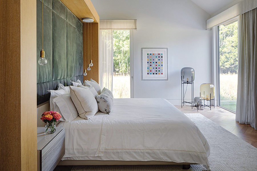
In the primary bedroom, a trio of handblown Pulpo lamps of various sizes featuring polished glass globes with filament bulbs illuminate and intrigue. Day designed the bed and headboard, which are upholstered in suede and leather by Maharam. / Photo by Greg Premru
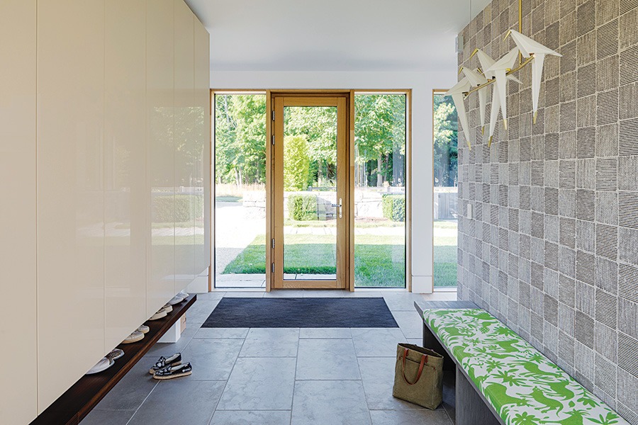
Photo by Greg Premru
SENSE OF PLACE
Nods to the home’s surrounding landscape are found throughout the house, including in the mudroom, which leads to and from the flower and vegetable gardens. Limestone floors and a sleek wall of Molteni & C closets ensure coats and footwear are tucked neatly away while a bench is upholstered with a vibrant green-and-white Holly Hunt fabric depicting wildlife and vegetation. Above, an artistic, whimsical Moooi linear suspension light fixture features five birds perched on a brass rod.
Architect
Vita Design Group
Builder
Coastal Construction Group
Interior Architect And Designer
LDa Architecture + Interiors; Blue Hour Design
Landscape Architect
Katherine Herman Design
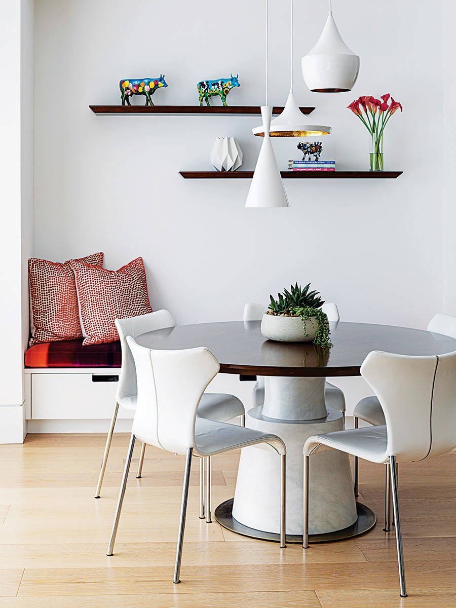
Day designed the breakfast table, which has a solid marble base with a bronze plate and a walnut top. Shelves showcase collectibles, and the banquette cushions feature orange, which nods to the family’s Dutch heritage. / Photo by Greg Premru
First published in the print edition of Boston Home’s Spring 2024 issue, with the headline “Lay of the Land.”